Workers in America’s oil and gas patches have enjoyed some of the country’s biggest gains in the buying power of their paychecks over the past decade and a half, while workers in several small and mid-sized manufacturing-oriented cities have watched their buying power shrink over the same time period.
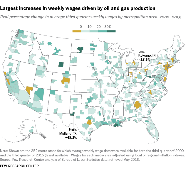
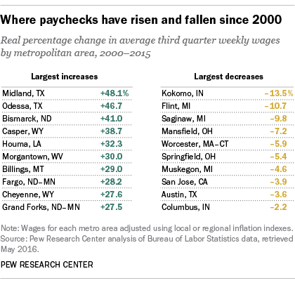
A Pew Research Center analysis of federal wage data found that since 2000, most of the biggest inflation-adjusted gains in average weekly wages have occurred in metropolitan areas that have directly benefited from the boom in U.S. energy production – places like Midland and Odessa, Texas; Bismarck, North Dakota; Casper, Wyoming; and Houma and Lake Charles, Louisiana.
 In the Midland metro area, for example, the average weekly wage was $581 in the third quarter of 2000 but more than double that ($1,170) in the third quarter of 2015, the most recent period for which data are available. Adjusted for local inflation, this represents a 48.1% increase in real purchasing power over that 15-year period. (Because wage patterns in most places are strongly seasonal, we based our comparisons on the third-quarter figures for each year.)
From 2000 to 2014, in fact, Midland had the nation’s largest increase in the share of adults living in upper-income households, according to a recent Pew Research Center report on the shrinking of America’s middle class. In 2014, 36.8% of metro Midland’s adults lived in households with more than double the national median size-adjusted income, up from 18.5% in 2000. But given the steep drop in oil prices since 2014, the prosperity of such energy-dependent communities may not last. Indeed, the real average weekly wage in Midland fell 6.2% between the third quarter of 2014 and last year’s third quarter.
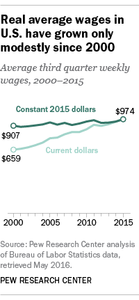
 For the nation as a whole, average weekly wages rose by 7.4% in real terms between 2000 and 2015. Most of that gain came after the 2007-09 Great Recession ended: In the third quarter of last year, the average weekly wage was $974, up an inflation-adjusted 6.6% from the same period in 2008.
All in all, real wages rose by more than the national average in about 200 metro areas. Not all of them are tied to the energy sector: Several of the fastest-rising metros are university towns, such as Charlottesville, Virginia (the University of Virginia), Bellingham, Washington (Western Washington University) and Morgantown, West Virginia (West Virginia University). Others have significant health care industries, such as Rochester, Minnesota (the Mayo Clinic) and Sioux Falls, South Dakota (Sanford Health).
Real wages fell in 22 metro areas, none more so than Kokomo, Indiana. The average weekly wage in metro Kokomo was $839 in the third quarter of 2015, down an inflation-adjusted 13.5% from the same period in 2000. Kokomo, like many manufacturing-based cities, hadn’t fully recovered from the 2000-01 recession when the Great Recession struck, battering it even further.
While most of the other real wage declines occurred in small to midsized manufacturing centers in the Midwest and Northeast, there were some surprises. Real wages in the San Jose, California, metro area, which includes Silicon Valley, were 3.9% lower last year than in 2000, dropping precipitously in the early 2000s after the collapse of the dot-com bubble and only recently returning to pre-bust levels. Austin, Texas, has added more than 300,000 jobs since 2000, but its real average wage has actually fallen slightly over that time.
The data used in this post come from the Quarterly Census of Employment and Wages, a Bureau of Labor Statistics program that gathers data from unemployment-insurance tax forms filed by more than 9 million employers. (Average weekly wages are calculated by dividing quarterly total wages by average total employment for the quarter, then dividing the result by 13.)
We adjusted the raw wage data for inflation using local and regional inflation indexes. The BLS produces monthly indexes for each of the four census regions (Northeast, Midwest, South and West), and within each region for large (greater than 1.5 million population) and smaller (50,000 to 1.5 million) metro areas, as well as for the three largest metro areas (New York, Los Angeles and Chicago). About three dozen metro areas were excluded from the analysis because they were either newly designated, combined with a neighboring metro area or reclassified as a “micropolitan” area during the period.
Some caveats are in order. Since the wage data, by definition, only cover employed people, they don’t say anything about a metro area’s employment level or job growth. Growth in real wages can mean rising employment in established, relatively well-paying sectors, or a shift of jobs from lower- to higher-paying industries. And real wages can stagnate or fall even if total employment rises, an indication that jobs may be shifting from high-paying but declining industries (such as manufacturing) to growing but lower-paying sectors (such as retail).
The analysis discussed here is based on data different from those used in other discussions of wage and income growth. For example, BLS data on usual weekly earnings show much slower growth – about 1.8% between the third quarter of 2000 and the third quarter of 2016. However, those data are medians rather than averages, include only full-time workers, and are self-reported. (Using averages rather than medians may skew the results upward.)
Other analyses are based on household income, which is a broader concept than wages (including, among other things, self-employment income, interest and dividends), and which covers all persons in a household, not just those who are employed. Like usual weekly earnings, household income is self-reported.


