Newspaper Websites
For a generation of election nights, the nation’s newspapers have been relegated to an afterthought. While they might have promised depth and analysis, in reality, it was often less clear what the papers the next day offered that political junkies who had watched well into the night had not already learned.
The Internet offers the potential to turn that upside down. Whatever advantage might be promised in the supposed thoroughness, precision, sophistication and turn-of-phrase offered by the culture of newspapers and the nature of the edited written word could now be delivered to audiences in real time. Newspapers could compete directly with television.
How did newspaper Web site fare?
After monitoring several sites, one has the sense of a medium in process, still finding itself. Several questions still need to be answered.
It is unclear whether newspapers are comfortable trying to combine giving readers news instantly while providing the depth and nuance for which they are famous. How much should a newspaper Web site concern itself with breaking news, versus interpreting it, since the two tasks are often at odds when time and resources are limited?
One option would be incorporating real-time news from other sources, such as wire services. But what is a newspaper site to do if those other sources contradict each other? How much should the secondhand sources be segregated from the newspaper’s original information on the site, or integrated? Do the standards of accuracy that the newspaper promises the next morning hold in the faster environment online? For the biggest sites, such as the Washington Post or The New York Times, how much should they emphasize national versus local if they are directly competing with the broadcast and cable sites that have no hometown?
The answers were not settled in 2006. The questions simply became easier to identify.
To get a sense of this, we monitored four different newspaper Web sites: those of two national papers—the NYTimes.com and the Washingtonpost.com, the largest West Coast paper—the LA times.com, and one that was in the home of a key Senate race—the Virginian Pilot.
NYTimes.com
On NYtimes.com, ranked as the 5th most popular news site according to Nielsen//Net Ratings for October, the election took lead position on both the home page and in a full column of headlines along the left-hand side. The vast majority of this coverage was staff produced and catered to a combination of both a local and national audience.
At 2 p.m., the lead headline was national: “As Voter’s Pass Judgment, Many Confront Technical Bugs”—and it sat over a multi-media package with a narrative piece on voters’ problems, a related staff audio report and links to two other related stories. But the lead photo was local: the New York State Comptroller heading out to vote, with a narrative report and additional local voting information attached. Below the photo, was a link to “Blog Blast,” the site’s blog that, on Election Day anyway, was more local than national.
There were two other interactive election features on the front page. The first was a discussion forum that asked readers what headlines they would like to see in the morning. The first few posts were titled, “Earth Collides with Pluto, Not A Planet Says Bush” and “America to George Bush: DROP DEAD!”
The second interactive feature, further down the page, was a link to a “2006 Election Guide”—an interactive map with a complex filtering system. Users could choose to sort through states where President Bush or Bill Clinton campaigned, for example and could also “create scenarios” where one could select from a list of possible outcomes to see how the map would look in each case.
From 2:30 to 6:00 p.m., before any official election results arrived, the front page remained relatively static, with slight updates to the lead story and a new video about voters in Virginia. The staff blog was a bit more active. There were postings on Senator Lieberman, the election night line-up at the network anchor desks, and New York campaign funds.
After 7 p.m., the site began to offer more regular news updates, but nothing close to continuous coverage. At 7:33 p.m. there was an exit poll story examining which issues were on voters’ minds. Beyond this first story though, the exit poll data was noticeably absent from the content.
When it came to calling races, historically a TV strength, the site was a few steps behind. Many races were called 20 – 30 minutes or more later than on TV or even other Web sites. The Santorum defeat, for example, was not posted until 9:31 p.m.—roughly 30 minutes after being announced on air. The interactive map was updated more regularly and gave a quick rundown on where certain races stood. But even here, the tallies lagged behind TV.

Overall, the Times’ Web site offered users a wealth of original content, and some combination of depth and speed. But in trying to be speedy its potential depth may have been undermined. One senses that trying to walk the line between being an “election night live” site and a newsroom organization that tries to understand and explain, is a divided task that will take some sorting out.
Washingtonpost.com
Election news was front and center at the Washington Post Web site with a page jammed with campaign-related headlines and other multi-media content. It was these extras that made the site distinctive.
The lead package at 2 p.m. was about voters heading to the polls and had six different related links, including an opinion piece by Post columnist Dan Froomkin, a viewing guide for the night called “The Fix” and an interactive map.

The site also featured several different interactive offerings. There was “Midterm Madness,” a game one could play about control of Congress, and “Voter’s Voice,” an election discussion forum with both local and national threads. Users posted both long- and short-winded accounts about their voting experiences: “May I just point out that in Northern Virginia there were lines to vote. As my candidate would say – OOH RAH!”
And a bar across the top held a video report on voter issues and a link to the locally focused “Election 2006” page with information such things as voting hours and locations.
The site changed little until around 7 p.m., when a ticker appeared across the top of the screen that continuously updated races. It was fed by the Associated Press and, as a result, the calls were much more timely that at some other sites. The Pennsylvania Senate race call, for instance, ran across the ticker at 8:30 p.m., a full hour before that story appeared on the New York Times site.
There was still staff reporting from 7 to 9 p.m. In those hours, the bulk of activity came from the ticker, the blog, the open discussion and the Q&A.
From 9 to 11 p.m., a few new stories finally appeared. One analyzed the Maryland Senate election and the Democratic Senate seat pick-ups in Ohio and Rhode Island. In the 10 o’clock hour there was an odd back and forth on the Maryland Senate race. The Post ran the Associated Press’s call that Cardin had won. But then it rescinded the call, raising the possibility that the race was still in play. At 10:58 p.m., the site posted a story that Democrat Ben Cardin was ahead and that the Associated Press had already called the race for him. Before long, though, the Post itself projected a win for Cardin.
Such contradictory elements may reflect two differences with newspaper Web sites and some other traditional news organizations. TV networks are accustomed to building Election Night political desks that make official declarations about what races can be called and what cannot on the air, which enforces a kind of official declaration or uniformity, including assembling academics, political scientists and pollsters to help them make those calls. Newspapers do not have that history. Second, Web sites are a hybrid of aggregated material from others and original content, in different places on the site. Such combinations invite contradictory verdicts, at least as of now.
LATimes.com
The Web site of the Los Angeles Times was a combination this election night of an up-to-date version of its newspaper with the added bonus of interactive and multi-media features. There was a blog, with postings from users, and what would prove an up-to-the-minute graphic on House and Senate races. But ultimately the site was not as deep as some others for national news, and by the time it was 11 p.m. on the East Coast, the California news had not yet come in, though the governorship was settled.
The site’s home page had most of the latest material. Its special election page did not become particularly active until late in the evening.
At the beginning of the afternoon, the home page featured two political stories, each with links to the Times’ political blog (Political Muscle), photo galleries and a public discussion board—“Who’s going to win control of Congress? What races are you watching? Does this election matter as much as people are saying?”
The site was easy to navigate and understand and made heavy use of multi-media components, not just interactivity. Most of the political stories came with graphics, photo galleries and video from the paper’s sister TV station, KTLA.
It was also easy for users to see how up-to-date the material was. The site refreshed automatically and featured time stamps on all the stories so users could see how fresh they were.

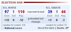
Just before 8 p.m. EST, the site added a colorful table on top of the homepage, using the AP as a source, to start calling races and how many seats each party needed for the House or Senate, though it was unclear whether these “calls” in the races were based on exit polls or actual results or a combination. It began with a Republicans net loss of 11 seats, then 12, then by 9 p.m. it was 13.
This, however, for some time represented the page’s most up-to-date element. And it offered no clear idea of which seats were being called. This made the map less useful than some others available from national news sites such as ABC or CNN.
Late in the evening, the Times site became a major source for California news. But for anyone on the East Coast, as Sinatra might have crooned, this came in the wee small hours of the morning.
Virginian Pilot
 In Virginia, PilotOnline, the Web site of the Virginian Pilot newspaper, would offer an interesting test of how much a significant local and regional paper could offer users about a pivotal race.
The site offered a voter blog and a place where Pilot reporters were posting real-time reports—of a very limited nature. There were also links, for those savvy enough to know which ones would be useful, to places like the board of elections that would offer up-to-the-minute results. These, however, were fairly subordinated on the site.
Overall, local newspapers looking to be detailed election night resources can do a great deal more than the PilotOnline. The site’s election page was accessed through an “Election” graphic on the home page and was highly local, focused on the US Senate race between George Allen and Jim Webb, and the US House 2nd District race between the incumbent Thelma Drake and Phil Kellam. The page was designed to help voters throughout the campaign rather than on election night per se. The bulk of the material, in other words, was older stories that had accumulated over weeks on the two races. For election night, the paper simply added some links to the top of the page to races from around the country and links for users to send in photos of their voting experiences. This photo section also included a clean, easily grasped graphic illustrating which Senate seats were up for grabs and how they had come out.
There was no video or audio here, but there was a notable emphasis on user comments and “have your say” features. But in all, readers would post a mere seven comments through the night.
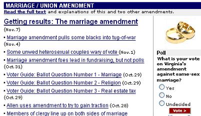
At the bottom of the page, there was a special section on state’s proposed marriage/union amendment, with the full text of the proposed amendment, and links to news stories about the amendment posted during the campaign. Also at the bottom of the page was a paper-sponsored blog where reporters would post material through the night, plus links on voting logistics: state board of elections, election night results, finding one’s polling place, some of which would be helpful for getting results if one knew to look there.
As the afternoon began, the site featured a story about high voter turnout and some voter intimidation. At 2:45 p.m., that piece was updated with a story about turnout perhaps being double that of the last midterm.
From then on, much of the activity on the site was on its reporter blog, with updates that were all in a tone more informal than the newspaper would be. At 3:25 p.m.: “We’re more than half-way through Election Day 2006. Here’s what we’ve learned so far.” Or a few minutes later: “About those phone calls. Don’t be confused….State election officials promise they are not calling people to tell them their voting precinct had changed.” Through the evening, the reporter blog would accumulate a total of seven posts.
In the end, the site was a blend, its campaign election page converted, for an evening, into an election night page, but not really being designed as that. Yet there was a fair amount of good thinking, and attempts at helping voters, built around those parameters.


