 One of the most robust findings of our report is how closely people’s perceptions of their economic progress over time square with economic trends from the Census and other key government data sources. When people in the middle class say they haven’t moved forward in life in recent years, the economic data say they’re right. And when they say that they’re doing better than their parents did when they were the same age, the economic data once again say they’re right.
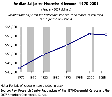
Let’s first look at the long term trends. From 1970 through 2007, median annual household income increased by a  total of 41%, after adjusting both for inflation and for the decline in household size.4 Most economists agree that trends in inflation-adjusted median household income are the best single indicator of a population’s changing standard of living. But they are not the only measure. Our report also examined changes over time in household wealth and household expenditures. All three indicators tell essentially the same story: over the past several decades, there has been measurable progress in America’s standard of living.
However, trends for the population as a whole do not always explain what has happened to different sub-groups within the population. Have some done better than others? And, in particular, how has the middle-income tier fared since 1970 compared with groups above and below?
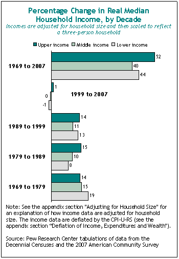
When it comes to household income, the middle income group has not fared quite as well as the lower income group (those in households with annual incomes below 75% of the median) or nearly as well as the upper income group (those in households with annual incomes above 150% of the median). Since 1970, the median income of the middle group has risen by 40%, compared with 44% for the lower group and 52% for the upper group (all rates adjusted both for inflation and changes in household size).
A similar analysis of the change over time in the median net worth of these three income tiers produces a more pronounced contrast in fortunes. The median net worth of the upper income tier rose by 115% from 1983 to 2007, compared with a rise of just 68% for the middle income tier and 44% for the lower tier. Thus, over several decades, the middle and lower income groups have been making absolute economic progress while experiencing relative decline.
There is one more trend analysis that fills out the story line. When we look at changes in median household income by individual decade rather than over the 40-year span, we can see why so many Americans feel they are stuck in their tracks — and why they felt this way even before the onset of the current recession.
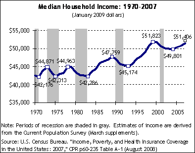
 As the chart to the right illustrates, the middle income tier has made virtually no gains at all in median household income during this decade (at least not through the end of 2007, the last year for which data for this analysis are available), and neither have the groups above or below them. For the typical American household, the Great Recession that began in December 2007 was preceded by a less dramatic but equally unusual economic phenomenon: a Phantom Recovery. Inflation-adjusted median household income has remained below its 1999 peak in every year since then, first during the shallow recession at the start of this decade and later during the economic “recovery” that ran from the end of 2001 through the end of 2007. In fact, the eight-year period from 1999 to 2007 is the longest in modern U.S. economic history in which median household income failed to surpass an earlier peak. The Census Bureau has not yet released household income data for 2008, but the recession has likely kept this indicator below its 1999 peak for another year, and may keep it there on into the next decade.
The bottom line is that the middle class has it right. Over the long haul, its standard of living has risen. But over the course of the past decade, it hasn’t.


