 In 2016, presidential campaigns still deploy and maintain websites as a way of communicating with and mobilizing voters. But as campaigns increasingly prioritize social media outreach, the role of campaign websites has changed – and in some cases narrowed.
A new Pew Research Center study of the campaign websites of Democratic presidential candidates Hillary Clinton and Bernie Sanders and Republican Donald Trump finds that Clinton’s website oriented around original news content, while Trump mostly posted stories from outside news media, and Sanders was somewhere in between.1 In addition to news updates, the three candidates also published some static content, particularly statements on their policy positions (in Trump’s case, many were delivered in video form).
Gone are some of the features that in 2012 gave people a place to comment or express opinions on the campaign websites. For Clinton in particular, message control extended to the news items produced: Her campaign has almost entirely bypassed the news media in terms of web content, instead emphasizing news produced in-house, similar to Obama’s approach in 2012 (though a number of her news updates did contain links to outside news media).
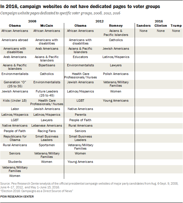
Another stark difference compared with the previous two election cycles is the absence of specific areas on their websites aimed at different social and demographic groups such as seniors, African Americans or rural Americans. In 2012, visitors to Obama’s website were offered opportunities to join 18 different constituency groups, among them African-Americans, women, the LGBT community, Latinos, veterans/military families or young Americans, with content targeted to each constituency. The Romney campaign featured a communities section that by early August 2012 featured nine groups with specialized content. In 2016, none of the three websites studied have a dedicated page or customized content for these kinds of voter groups.
This analysis is part of a larger study by Pew Research Center of the news and information that campaigns directly communicate to voters, which is also the third in a series of reports on presidential candidates’ digital footprints. This exploration of campaign websites, along with those of the 2012 and 2008 major party candidates, offers something of a time capsule, reflecting the political priorities and digital communication strategies of the moment.
This analysis is focused on the static features of each candidate’s website, between the weeks of May 1 and June 15, 2016, a period in the campaign when Trump became the presumptive Republican nominee and Clinton gained momentum over Sanders in her quest to secure the nomination.2 More details on the methodology for this report can be found here.
Candidates differ in the news they offer and the orientation of their sites
Candidate websites have, in four years’ time, become somewhat leaner. Hillary Clinton’s site averaged two original posts per day during the time period studied (though if Spanish translations of the English-language posts were counted, that number would rise to three), while Bernie Sanders’ and Donald Trump’s sites each averaged three original posts per day. Frequent blog posts helped boost the average number of posts per day in 2012 to eight for Obama’s website and four for Mitt Romney’s.
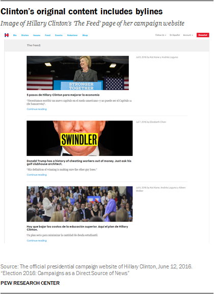
Clinton’s site offers two main sections for news updates related to her campaign: “The Feed” and “The Briefing,” both of which mimic the look and feel of a digital news publisher, complete with professional styling and, in the case of The Feed, bylines. All of the content appears to be original and produced in-house; it consists of text-driven articles, some with videos embedded, but few traditional press releases.3 The site connects with its Spanish-speaking audience by providing translations of English-language posts in The Feed. During this period, 20 Spanish-language posts were found, the vast majority of which were translations of English-language news items. There is no section on the site for links to external news articles – a choice also made by the Obama campaign in 2012.
Trump’s site offers much less original news content than Clinton’s. What is there mostly consists of press releases found in a dropdown menu of the site’s “Media” tab. During the time period studied, no Spanish content was identified among the news items posted by the Trump campaign. The same menu offers another section full of links and excerpts from articles produced by outside sources such as Fox News or CNN, content that forms the majority of the news material offered by the site. The Trump site does offer video content, but these videos largely appear in sections devoted to the candidate’s policy positions and produced as more evergreen pieces, which are not part of the purview of the news analysis here. Some videos on the Trump site are clips from outside news organizations and appear under the Media tab.4
Sanders’ site contains elements that overlap with both Clinton’s and Trump’s sites. “Democracy Daily” is a repository for news articles from outside news organizations that highlight issues or the campaign. The “News” section contains both press releases and original posts that give updates from the field, though these sections were not as frequently updated as on Clinton’s site during the time period studied here. Some of these posts, as with Clinton’s site, are multimedia, while there were also three Spanish translations of news items.
A tightly controlled platform
One aspect of campaign websites that has fluctuated in recent election cycles is the balance between a tightly controlled message and public participation. In 2016, the emphasis of all campaigns is clearly on the message, especially when it comes to news content.
Unlike previous cycles, none of the sites offer the user the option to create a personal fundraising page. In addition, candidates’ news verticals did not have comment sections.
When it comes to other kinds of public engagement, Sanders stood out for offering certain options on his website for people to become involved in the campaign, both in online and offline ways. Visitors to the Sanders website can find out how to make calls on behalf of the candidate with customized scripts. The site also provides pre-scripted tweets on behalf of the candidate. For Clinton and Trump, voter engagement is mostly limited to email and volunteer list sign-ups and requests for donations and, in Clinton’s case, the opportunity to host events – which the Sanders site offers as well.
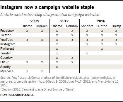
 The relatively static nature of these website designs may reflect the idea that social media platforms have become the new place for more interactive engagement with citizens (though the Center’s separate analysis of candidates’ social media activity suggests this is not entirely the case). Nevertheless, aside from some links to social sites, website visitors do not get much of a window into what candidates are saying on social media. While the websites of all three candidates studied here link to their social media feeds (these include Facebook, Twitter, YouTube and now Instagram for each, with the addition of Pinterest for Clinton and Tumblr for Sanders), neither Clinton nor Sanders includes any of their live social feeds on their websites. Trump, on the other hand, displays his live Twitter feed in a widget on his homepage.
One hallmark of campaign websites in 2012 and 2008 was outreach to voter affinity groups, with offerings of customizable information and ways to connect with people of similar backgrounds or interests. In 2012, Obama’s campaign offered opportunities to join 18 different constituency groups, while visitors to Romney’s website could choose from nine different voter group pages. In 2008, both candidates offered roughly 20 such dedicated pages. In 2016, this feature is no longer present. None of the three websites featured any distinct section addressing specific voting groups or segments of the population. There are still “issue” pages – pages dedicated to the candidates’ position on certain issues, which were also present in earlier years. Trump’s site, for example, includes pages that explain his position on Veterans Administration reforms and Second Amendment rights; Sanders has pages about his views on native Hawaiians’ rights and women’s rights; while Clinton does for workers’ rights and LGBT rights. These allow a visitor to learn a candidate’s current views on a policy or group-related issue but do not allow for a way to identify with the candidate or connect with other supporters.
One type of customization all three campaigns offer their visitors is at the state level, though this feature has been in flux. Clinton’s state-level pages – aimed at battleground and primary states at the time of the study’s field period, but since expanded to include all 50 states and the District of Columbia – mainly offers individuals the opportunity to sign up to volunteer. The 50 state pages (as well as the District of Columbia and U.S. territories) on the Sanders campaign site feature information about voting in each state’s primaries and caucuses, including the type of primary, ID requirements and early voting dates. At the time of analysis, Trump’s site offered a customized option for 37 states. However, the link to this feature was later removed from the homepage.


