On Oct. 1 the Pew Research Center’s Project for Excellence in Journalism, in collaboration with The Economist Group and the data visualization website Visual.ly, invited designers to visualize data from The Future of Mobile News report, a survey of more than 9,500 adults that delved deep into mobile news consumption habits.
The Future of Mobile News Infographic Challenge invited people to examine data from the report and create their own infographic. Visual.ly hosted the challenge. A team of judges from PEJ, The Economist Group and Visual.ly scored the submissions in five categories: creative use of data; clarity; aesthetic appeal; and adherence to visualization best practices. From a number of strong submissions, the judges selected four infographics-which now are featured on PEJ’s website, The Economist’s Tumblr, Pinterest, and Facebook pages and The Economist’s Graphic Detail blog.
Each of the selected infographics offered something unique in its creation. The visualizations also speak to the challenges of visual storytelling and visual rendering of data – tools that are becoming a more regular element of digital reporting. First and foremost, of course, is accuracy. A successful infographic has to ensure that not only are individual numbers correct, but also that they are assembled together in a way that tells an accurate story. Another challenge is figuring out how much to cover in an infographic. How much information can one impart before it gets to be too much for the viewer to digest? And finally, is the challenge of creating the visuals themselves.
“The best informational graphics make data easy to understand,” said Pew Research Center’s Graphics Director Michael Keegan, who has overseen and designed news graphics at major news organizations for more than 35 years. “Well-designed charts and diagrams are the shorthand to complex information that may otherwise go unread-or worse-be misunderstood. Getting to the heart of the matter-succinctly, accurately, and with a bit of flair-is the ultimate test of a graphic’s success.”
For more on the contest and the selected infographics, read The Economist’s Group’s LeanBack 2.0 blog and Visual.ly’s blog post.
Featured Infographics
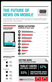
The Future of News on Mobile (Jen Lebeau and Amy Li)
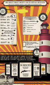
The Great Tablet Society and Its Rituals Revealed(Damage(Máriusz Bari) and Tablet2Cases)
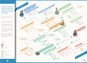
The Explosion in Mobile Audiences and a motion graphic, based on the infographic (ElkanoData)
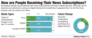
How Are People Receiving their News Subscriptions? (West Virginia University student Brittany Furbee)


