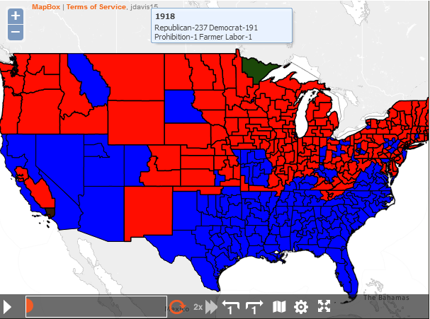
Anyone (well, almost anyone) could make a map, or even a series of maps, about party control of Congress over time. But turning that data into an interactive that’s in its own way as addictive as Minecraft or Fruit Ninja is something else again, which is where MapStory comes in.
MapStory is a nonprofit that’s created a online, open-source mapping platform to enable people to create and share data visualizations. Mapmakers have created timeline maps to illustrate everything from charter-school expansion in Minnesota to the proliferation of wind farms across the United States. But this interactive, uploaded to MapStory earlier this month by Jonathan Davis of Arizona State University, stands out both for the sheer amount of information it conveys and how darned fun it is to play with.
Starting in 1918, you can simply play the animation forward to 2012 and watch the shifting patterns of party control of the House of Representatives. Davis’ map also lets you freeze on specific years and zoom in to see individual districts; it also shows the handful of minor-party representatives who’ve gotten themselves elected to Congress over the decades. (That’s catnip for political-trivia buffs: Who knew that the Prohibition Party held a congressional seat in California in the years leading up to the 18th Amendment?)
Comparing past and present, a couple of related points become clear. First, districts have become more and more jigsaw-puzzle-like, as sophisticated mapping software and detailed demographic data have combined to make gerrymandering a fine art. And partly as a consequence, Democratic and Republican seats were more geographically intermixed in 2012 than in 1918, when virtually all seats in the South and Southwest states were held by Democrats and most Northern states were dominated by the GOP.


