(Related posts: Introducing pewmethods: An R package for working with survey data, Exploring survey data with the pewmethods R package and Weighting survey data with the pewmethods R package)
Pew Research Center makes most of its survey data available for free online. This includes datasets from the annual Global Attitudes Survey, a poll that asks adults in many countries about issues ranging from politics to economic conditions. These files are generally available for download in IBM’s SPSS .sav format. But even without access to SPSS, any student or researcher can analyze these multi-level datasets using the free, open-source R statistical software platform.
This post walks through an analysis of data from the Center’s spring 2017 Global Attitudes Survey, which you can access here. (You will need to create a free account before downloading.)
Once you have the file saved it in a handy location, you can start analyzing the data with the Center’s new pewmethods R package. This package allows you to generate country-level crosstabs in the same way that researchers at the Center conduct their analyses. You can read more about our new R package here.
The pewmethods package is hosted on the Center’s Github page. You can get pewmethods by first installing the devtools package:
install.packages(“devtools”)Next, run the following line of code:
install_github(“pewresearch/pewmethods”)We’ll also use the tidyverse package, which lets us open the data from the .sav extension as well as assists in recoding variables and filtering the data. My colleague, Nick Hatley, has written a great intro on using R and tidyverse to analyze Center survey data. Later on, we’ll make a map and an opposing bar chart, so we should load the required packages for those at this point as well. You’ll need to install these packages first in order to run the code in this post. Even if you have already installed them, you can update them by running the first line (install.packages…) in the below code block. We load the packages into our R session with the library() function.
#install.packages(c(“tidyverse”, “rworldmap”, “ggrepel”))
library(pewmethods)
library(tidyverse)
library(rworldmap)
library(ggrepel)# You will need to adjust the file path in the parentheses below depending on where you save the downloaded dataset
gap_rd <- haven::read_sav(“2017 Topline.sav”)
This dataset has more than 800 variables and 40,000 rows. For this explainer, I’ll examine two economically focused questions from the 2017 survey, published in the report, “Global Publics More Upbeat About the Economy.” Since I’m just looking at two survey questions here, I’ll only need a handful of variables. We can narrow down the dataset to the variables of interest using the `select` function.
gap2017 <- gap_rd %>%
  select(
    Country,  # country variable
    econ_sit,  # current economic situation in your country
    children_betteroff2,  # will children be better off/worse off than parents
    weight     # survey weights - very important!
  )%>%
  haven::as_factor()
Rearrange and explore the data
Now we have a dataset that is much more user friendly, with six variables and around 42,000 observations. We can identify the countries included in the survey, find the exact question wording based on the SPSS labels, and get country-level estimates for questions of interest.
Here, we will look at two questions:
1. How did people view their country’s economic situation in 2017?
2. Did people think that children in their country would be better or worse off than their parents?
> unique(as.character(gap2017$Country))  # 38 countries
 [1] "United States" "Mexico" "Canada" "Russia" "South Korea"
 [6] "United Kingdom" "France" "Germany" "Netherlands" "Spain"
[11] "Sweden" "Poland" "Greece" "Hungary" "Italy"
[16] "Japan" "Australia" "India" "Indonesia" "Philippines"
[21] "Israel" "Turkey" "Argentina" "Brazil" "Chile"
[26] "Colombia" "Venezuela" "Ghana" "Kenya" "Nigeria"
[31] "South Africa" "Senegal" "Tunisia" "Vietnam" "Jordan"
[36] "Lebanon" "Tanzania" "Peru"> get_spss_label(gap2017, c("econ_sit", "children_betteroff2"))
[1] "Q5. Now thinking about our economic situation, how would you describe the current economic situation in (survey country) — is it very good, somewhat good, somewhat bad or very bad?"
[2] "Q8. When children today in (survey country) grow up, do you think they will be better off or worse off financially than their parents?"
With the launch of the pewmethods package, we can easily convert the data from individual- to country-level data, first with the economic situation question. The line of code below tells R to look at the econ_sit variable in the gap2017 dataframe, apply survey weights called weight, group the data by the country2 variable, and round it to the nearest whole number. The resulting object will be in a wide format.
> econ_data_wide <- get_totals("econ_sit", gap2017, wt = "weight", by = "Country", na.rm = T, digits = 0)
> head(econ_data_wide)
For analysis and graphing purposes, it might be easier to have the data in a long format instead. We can use the gather function from the tidyverse package to transpose the data, renaming the country variable to “country” and the percent values “economy.”
> econ_data_long <- econ_data_wide %>%
  gather(country, economy, -one_of("econ_sit", "weight_name"),
  factor_key = T)
> head(econ_data_long)
                  econ_sit weight_name   country economy
1                Very good      weight Argentina       5
2            Somewhat good      weight Argentina      18
3             Somewhat bad      weight Argentina      44
4                 Very bad      weight Argentina      29
5 Don’t know (DO NOT READ)      weight Argentina       3
6    Refused (DO NOT READ)      weight Argentina       1
The global attitudes team at Pew Research Center (which I’m part of) usually collapses these into “good” and “bad” categories by adding the rounded totals for very/somewhat good and very/somewhat bad. One way to replicate this is below, with a preview of the first few lines of the new object. The spread() function is used to shape the dataset from long back to wide.
econ_sit_collapse <- econ_data_long %>%
mutate(econ_eval = case_when(
  econ_sit == "Very good" ~ "Good",
  econ_sit == "Somewhat good" ~ "Good",
  econ_sit == "Somewhat bad" ~ "Bad",
  econ_sit == "Very bad" ~ "Bad",
  TRUE ~ "DK/Refused")  # parenthesis closes call to `case_when`
) %>% # parenthesis before pipe closes call to `mutate`
  group_by(country, econ_eval) %>%
  summarise(share = sum(economy))
final_econ <- econ_sit_collapse %>% spread(econ_eval, share)> head(final_econ[c("country", "Good", "Bad", "DK/Refused")])
# A tibble: 6 x 4
# Groups:   country [38]
  country    Good   Bad `DK/Refused`
  <fct>     <dbl> <dbl>        <dbl>
1 Argentina    23    73            4
2 Australia    60    40            1
3 Brazil       15    82            3
4 Canada       59    38            2
5 Chile        45    54            1
6 Colombia     34    65            1
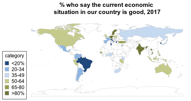
The 2017 report features a map of the data showing the share of adults in each country who said the economic situation was good. We can create a similar version below with the rworldmap package, which lets us create a map and adjust the colors in more customized ways.
We’ll recode the economy data into categories to mimic the color scheme in the report map (this time on a green/blue scale), turn it into a factor, and then re-level everything to keep it in the order we want, instead of the default alphabetical order. I also added colors from the Center’s style guide and a title to the chart, using hexadecimal values to get an exact color match and adding “\n” to the title make it break over two lines.
# recode econ_sit into categorical variable for map
final_econ <- final_econ %>%
  mutate(econ_good_cat = case_when(
    Good < 20 ~ "<20%",
    Good %in% 20:34 ~ "20-34",
    Good %in% 35:49 ~ "35-49",
    Good %in% 50:64 ~ "50-64",
    Good %in% 65:80 ~ "65-80",
    Good > 80 ~ ">80%") %>%
      fct_relevel("<20%", "20-34", "35-49", "50-64", "65-80", ">80%")
      ) %>%
  ungroupsPDF <- joinCountryData2Map(final_econ,
                            joinCode = "NAME",
                            nameJoinColumn = "country")mapCountryData(sPDF,
               nameColumnToPlot = "econ_good_cat",
               catMethod = "categorical",
               colourPalette = c ("#1F497D", "#8DB5E2", "#C5D9F1", "#C4CA8A", "#949D48", "#707636"),
               mapTitle = "% who say the current economic \nsituation in our country is good, 2017",
               missingCountryCol = "#F2F2F2")Output:
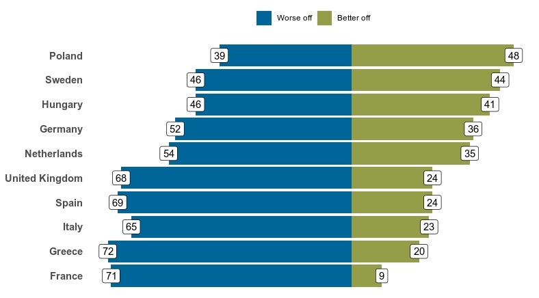
We can do similar analyses with other variables in the 2017 Global Attitudes Survey dataset. Say, for example, that a researcher is interested in how Europeans view the prospects of the next generation. The survey includes a question that asks whether respondents think children in their country will be better or worse off financially than their parents. We can view the positive and negative sides of the question for the European countries surveyed and display the results in a chart.
For a Europe-only graphic, we’ll first have to filter our dataset to European countries. Again, using the get_totals function, we can calculate weighted frequencies by country.
gap2017_EU <- gap2017 %>%
  filter(Country %in% c("United Kingdom", "France", "Germany", "Netherlands","Spain", "Sweden", "Poland", "Greece", "Hungary", "Italy"))children_data_wide <- get_totals("children_betteroff2", gap2017_EU, wt = "weight", by = "Country", na.rm = T, digits = 0)
children_data_long <- children_data_wide %>% gather(country, value, -one_of("children_betteroff2", "weight_name"), factor_key = T)
head(children_data_long)  # look at the top rows of the data
sample_n(children_data_long, 10)  # look at a random sample of 10 rows
The global attitudes team often displays data in horizontal bar charts. With the R graphics package ggplot2, which loads automatically as part of the tidyverse package, any researcher with data can do this, too.
First we will have to manipulate the data in order to make a plot that looks similar to those published in Pew Research Center reports. The opposing bar chart will require both negative and positive values, so we create a new variable called children_bars below that makes any “worse off” category negative while keeping the “better off” values positive. We map the bar color to our graphic using `fill = children_betteroff2`. We can use our new children_bars variable to sort the data based on the “better off” values. Otherwise, the sorting will not function in the way we want.
To create the dataset we need for the graphic, we filter the children_data_long dataframe to only the “better off” or “worse off” responses, pipe it to ggplot2 and customize the design. The fct_reorder function is part of the tidyverse and allows us to sort the data by the percent who say “better off” at the country level in descending order.
Below, I also specify the hexadecimal color to fill in the bars, use coord_flip() to make the bars horizontal instead of the default vertical and add labels to denote each category at the top and each bar’s value by country.
# specify top margin
margin(t = 10)
p <- children_data_long %>%
  filter(!(children_betteroff2 %in% c("Don’t know (DO NOT READ)",
                                      "Same (DO NOT READ)",
                                      "Refused (DO NOT READ)")
  )) %>%
  mutate(
    children_bars = ifelse(children_betteroff2 == "Worse off", value * -1, value),
    children_betteroff2 = fct_relevel(children_betteroff2,
                                      "Worse off", "Better off"),
    better_only = ifelse(children_betteroff2 == "Better off", value, 0)
  ) %>%
  ggplot(
    aes(x = reorder(country, better_only),
        y = children_bars,
        fill = children_betteroff2,
        group = children_betteroff2
    )
  ) +
  geom_bar(stat = "identity") +
  geom_label(
    aes(
      label = abs(as.numeric(children_bars))

    ),
    fill = "white"
  ) +
  scale_fill_manual(values = c("Better off" = "#949D48", "Worse off" = "#006699")) +
  coord_flip() +
  theme(
    axis.line = element_blank(),
    panel.background = element_blank(),
    axis.ticks = element_blank(),
    legend.position = "top",
    legend.title = element_blank(),
    axis.title = element_blank(),
    axis.text.x = element_blank(),
    axis.text.y = element_text(size = 11, face = "bold")
  )plot(p)
Hopefully this example analysis can be a resource for studying international survey data in your own projects. And remember, all the data from this post is available for free on our website.
Here is all the necessary code used in the post:
# Decoded - pewmethods with Global Attitudes
# just the code#install.packages(“devtools”)
#install_github(“pewresearch/pewmethods”)library(pewmethods)
library(tidyverse)
library(rworldmap)
library(ggrepel)gap_rd <- haven::read_sav("Pew Research Global Attitudes Spring 2017 Dataset WEB FINAL.sav")gap2017 <- gap_rd %>%
  select(
    Country,              # country variable
    econ_sit,             # current economic situation in your country
    children_betteroff2,  # will children be better off/worse off than parents
    weight                # survey weights - very important!
  ) %>%
  haven::as_factor()unique(as.character(gap2017$Country))  # 38 countries
get_spss_label(gap2017, c("econ_sit", "children_betteroff2"))  # gives us exact question wordingecon_data_wide <- get_totals("econ_sit", gap2017, wt = "weight", by = "Country", na.rm = T, digits = 0)
head(econ_data_wide)econ_data_long <- gather(econ_data_wide, country, economy, -one_of("econ_sit", "weight_name"), factor_key = T)
head(econ_data_long)econ_sit_collapse <- econ_data_long %>%
  mutate(econ_eval = case_when(
    econ_sit == "Very good" ~ "Good",
    econ_sit == "Somewhat good" ~ "Good",
    econ_sit == "Somewhat bad" ~ "Bad",
    econ_sit == "Very bad" ~ "Bad",
    TRUE ~ "DK/Refused")  # parenthesis closes call to `case_when`
  ) %>% # parenthesis before pipe closes call to `mutate`
  group_by(country, econ_eval) %>%
  summarise(share = sum(economy))
final_econ <- econ_sit_collapse %>% spread(econ_eval, share)head(final_econ[c("country", "Good", "Bad", "DK/Refused")])final_econ <- final_econ %>%
  mutate(econ_good_cat = case_when(
    Good < 20 ~ "<20%",
    Good %in% 20:34 ~ "20-34",
    Good %in% 35:49 ~ "35-49",
    Good %in% 50:64 ~ "50-64",
    Good %in% 65:80 ~ "65-80",
    Good > 80 ~ ">80%") %>%
      fct_relevel("<20%", "20-34", "35-49", "50-64", "65-80", ">80%")
  ) %>%
  ungroupsPDF <- joinCountryData2Map(final_econ,
                            joinCode = "NAME",
                            nameJoinColumn = "country")mapCountryData(sPDF,
               nameColumnToPlot = "econ_good_cat",
               catMethod = "categorical",
               colourPalette = c("#1F497D", "#8DB5E2", "#C5D9F1", "#C4CA8A", "#949D48", "#707636"),
               mapTitle = "% who say the current economic \nsituation in our country is good, 2017",
               missingCountryCol = "#ffffff")gap2017_EU <- gap2017 %>%
  filter(Country %in% c("United Kingdom", "France", "Germany", "Netherlands",
                        "Spain", "Sweden", "Poland", "Greece", "Hungary", "Italy"))children_data_wide <- get_totals("children_betteroff2", gap2017_EU, wt = "weight", by = "Country", na.rm = T, digits = 0)
children_data_long <- children_data_wide %>% gather(country, value, -one_of("children_betteroff2", "weight_name"), factor_key = T)
head(children_data_long)  # look at the top rows of the data
sample_n(children_data_long, 10)  # look at a random sample of 10 rows# specify top margin
margin(t = 10)
p <- children_data_long %>%
  filter(!(children_betteroff2 %in% c("Don’t know (DO NOT READ)",
                                      "Same (DO NOT READ)",
                                      "Refused (DO NOT READ)")
  )) %>%
  mutate(
    children_bars = ifelse(children_betteroff2 == "Worse off", value * -1, value),
    children_betteroff2 = fct_relevel(children_betteroff2,
                                      "Worse off", "Better off"),
    better_only = ifelse(children_betteroff2 == "Better off", value, 0)
  ) %>%
  ggplot(
    aes(x = reorder(country, better_only),
        y = children_bars,
        fill = children_betteroff2,
        group = children_betteroff2
    )
  ) +
  geom_bar(stat = "identity") +
  geom_label(
    aes(
      label = abs(as.numeric(children_bars))

    ),
    fill = "white"
  ) +
  scale_fill_manual(values = c("Better off" = "#949D48", "Worse off" = "#006699")) +
  coord_flip() +
  theme(
    axis.line = element_blank(),
    panel.background = element_blank(),
    axis.ticks = element_blank(),
    legend.position = "top",
    legend.title = element_blank(),
    axis.title = element_blank(),
    axis.text.x = element_blank(),
    axis.text.y = element_text(size = 11, face = "bold")
  )plot(p)


