Many researchers are interested in obtaining new kinds of data directly from websites. But collecting large amounts of data from a website can be impractical. When done manually, this approach is prone to human error. When automated, it may violate a website’s terms of service.
Instead, researchers typically rely on a tool called an API, which stands for Application Programming Interface. Web APIs provide a means of communication between websites and users, structured by rules. In particular, they allow users to obtain clearly defined kinds of data quickly, by requesting it directly from the database underlying a particular website. (This isn’t the only kind of API. For example, smartphone apps frequently use APIs to send data back and forth between your device and the application’s database. In this blog post, however, we’re focusing on APIs that deliver data from websites to users.)
Many major companies, as well as government agencies, have created public APIs. These organizations provide easy access to their data to encourage developers to use their platforms. At Pew Research Center, we regularly use APIs to collect information for the studies we produce. For example, we’ve used APIs in reports about online congressional communication, bots in social media, Google searches about guns, science pages on Facebook, and public comments on government policy.
How APIs provide data
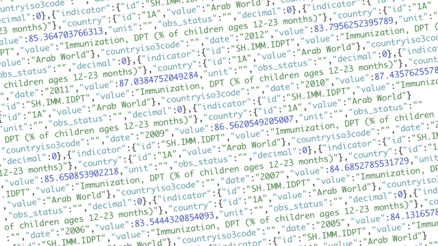
APIs provide data in various formats, but JSON is the most popular. JSON is a useful file format for structuring data because it preserves more hierarchical structure and meta information about a dataset than tab- or comma-separated files (such as .tsv and .csv files). Depending on the programming language you’re using for your data analysis, there are libraries that make JSON data manipulation intuitive. For example, in the R statistical language, you can use the jsonlite library to transform data from APIs into familiar R objects and classes.
APIs can be used in different programming languages
In order to interact with an API efficiently across a variety of computer programs written in different languages (such as Java, Python, R, etc), researchers rely on API “wrappers.” These tools — which exist for most popular APIs — allow a researcher to request data directly from an API while using their own programming language of choice. Below, we use the World Bank’s API as an example and access the data using R.
Example: How to interact with the World Bank’s API
The World Bank API gives researchers access to hundreds of variables about the health, wealth and culture of countries around the world. To show how to use this API, we can write a script to get a couple of variables and plot them. In this case, we’ll search for variables using the identifying codes provided by the World Bank, and then pull the variables into memory in R.
The code below uses the WDI package, an R package that includes a wrapper for the World Bank API. (A wrapper, as noted above, is a function or set of functions to execute calls to the API and convert the results into something more usable than what the API may return on its own.) To execute this code, you first have to install the WDI package, as well as devtools,ggplot2, gganimate, data.table, and dplyr. You can install these functions for R with the following commands:
install.packages(c(“WDI”, “ggplot2”, “devtools”, “data.table”, “dplyr”))
We’ll also install the gganimate add-on package for animation:
devtools::install_github(“dgrtwo/gganimate”)Now that these packages are installed, let’s load them into working memory:
library(WDI)
library(gganimate)
library(ggplot2)
library(data.table)
library(dplyr)
library(devtools)
The WDI package provides a convenient way to search the World Bank API for variables that might be interesting for research. Below, we specify the word we want to search for after the “string” field, and where to look for it — the “name” field. Doing so, we can see all the variables related to road infrastructure, immunization rates, and any other variables measured on a per capita basis.
#This code to search the API
WDIsearch(string=”roads”, field=”name”)
WDIsearch(string=”immunization”, field=”name”)
WDIsearch(string=”per capita”, field=”name”)
The search returns lists of variables and their corresponding codes. Now that we know the codes for the variables we’re interested in, we can call for the data from the API. We do this with the WDI function. Within this function call, we supply as arguments the countries we want (which is all of them), the variable codes, the first year of data, the last year of data, and an optional “extra” set of fields. The “extra” fields are country metadata — try turning this option off and on to see what happens.
# Interesting Variables to plot
# mortality per 1K women: SP.DYN.AMRT.FE
# immunization rates of DPT: SH.IMM.IDPT
# income per capita (constant): NY.ADJ.NNTY.PC.KD
# population: SP.POP.TOTL
# Getting the preliminary variables, using the code above
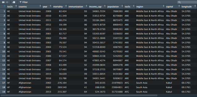
dat<-data.table(WDI(country=”all”, indicator=c(“SP.DYN.AMRT.FE”, “SH.IMM.IDPT”, “NY.ADJ.NNTY.PC.KD”, “SP.POP.TOTL”), start=1980, end=2017, extra=T))
The data are loaded into memory as a data.table object, which is a type of rectangular data frame that’s easy to interact with and analyze. One problem is that the variable names are not easy to interpret, so let’s convert them to something more intuitive. We do this with thedplyr package, which provides a set of tools for manipulating data. It has a convenient and readable syntax. We will use the “rename” command to rename the variables.
ndat = dat %>%
 dplyr::rename(mortality = SP.DYN.AMRT.FE, immunization = SH.IMM.IDPT,
 income_cap = NY.ADJ.NNTY.PC.KD, population = SP.POP.TOTL)
Next, let’s remove the missing observations so we can plot the data. Of course, you should think carefully about which countries are missing and why.
ndat = na.omit(ndat)
ndat = ndat[ndat$region!=”Aggregates”, ]
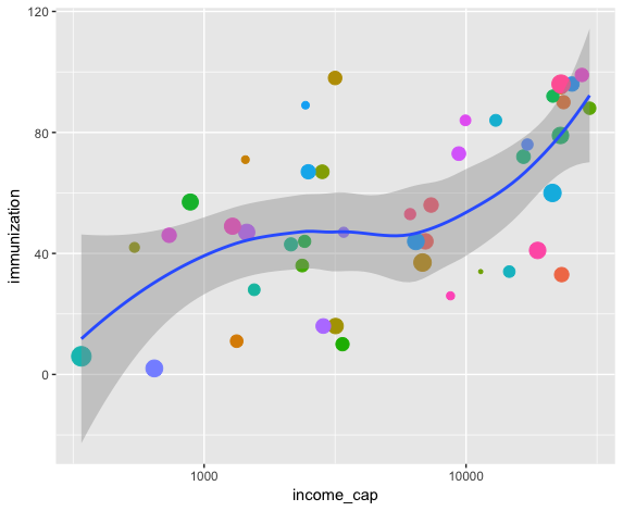
We can create a visual representation of the relationship between income and immunization rates for a particular year. We’ll plot one point for each country, sized by the log of the country’s population. We’ll plot a LOESS line of the general relationship, too.
Here is a static plot using ggplot2:
p <- ggplot(filter(ndat, year==1980), aes(income_cap, immunization, size = log(population))) +
geom_point(aes(col=country), show.legend = FALSE) +
geom_smooth(aes(group = year), method = “loess”, show.legend = FALSE) + scale_x_log10()
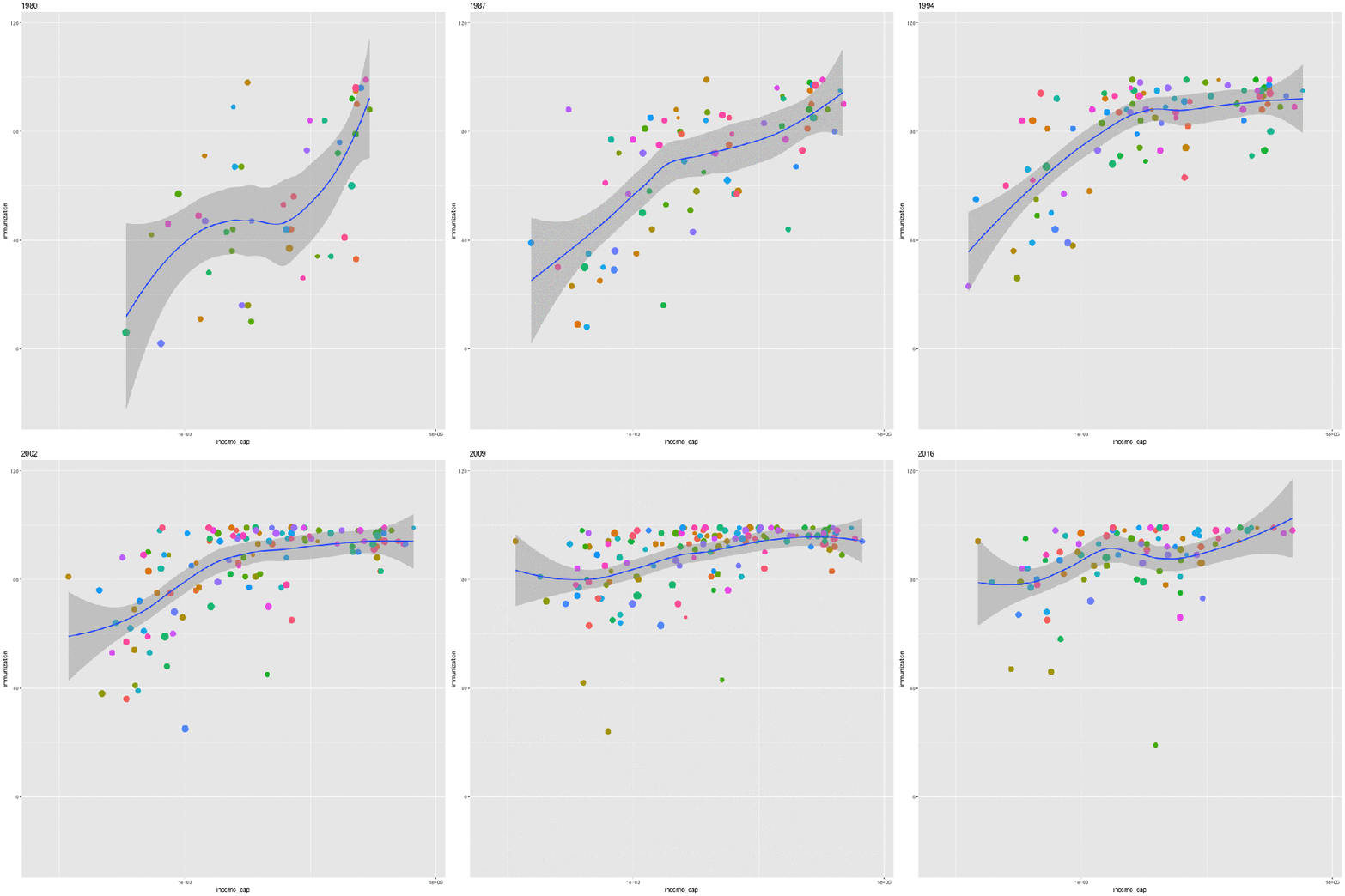
Finally, we’ll create an animation of the same relationship over time. To do so, first install ImageMagick. Then create a plot that includes all the years in the data:
p <- ggplot(ndat, aes(income_cap, immunization, size = log(population), frame = year)) +
 geom_point(aes(col=country), show.legend = FALSE) +
 geom_smooth(aes(group = year), method = “loess”, show.legend = FALSE) + scale_x_log10()
gganimate(p)
Some useful APIs
In addition to the World Bank’s API, here are some others that we’ve interacted with and found useful:


